IELTS graph 312 - How people in a European city reached their office and got back home
- Details
- Last Updated: Wednesday, 07 February 2018 12:13
- Written by IELTS Mentor
- Hits: 51511
IELTS Academic Writing Task 1/ Graph Writing - Pie Charts:
You should spend about 20 minutes on this task.
The graphs below show how people in a European city reached their office and got back home in 1959 and 2009.
Summarise the information by selecting and reporting the main features, and make comparisons where relevant.
You should write at least 150 words.
Journeys to and from work

Sample Answer:
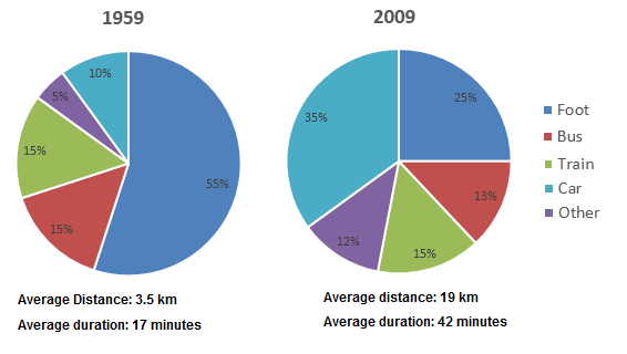
The pie charts delineate how citizens in a European city commuted to and from their offices in 1959 and 2009. Overall, more than half of the office-goers walked in 1959 while car use in 2009 significantly increased. Besides, people travelled more distance in 2009 at a faster speed.
According to the illustration, more than half of the job holders walked to reach their office and get back home in 1959 while only a quarter of them did so in 2009. Bus commuters in this city accounted for 15% in 1959 while it was 2% less after 5 decades. The ratio of office executives (15%) who used trains in both years remained the same. One in ten office commuters drove cars in 1959 but after five decades their percentage increased significantly, 35% to be exact. The use of different other transportations in 2009 increased than that of 50 years earlier.
It is worth noticing that the speed and average distance travelled by these commuters considerably increased in 2009 when a commuter travelled 19 kilometres on an average in 42 minutes compared to their average 3.5-kilometre journey in 17 minutes in 1959.

More than half of the workers went to their offices on foot in 1959, however, only a quarter still did so after 50 years. In contrast, the percentage of those using cars increased more than 3-fold to become 35% in 2009. The figure regarding train commuters in 1959 was 15%, and similar to that after 5 decades. As for other types of vehicles, they represent 12% in 2009, more than doubled the previous statistic, 5%.
It is worth noticing that in 1959, the average distance stood at 3.5 kilometres but then soared to 19 kilometres. Interestingly, people only spent 17 minutes on average in 1959 and 42 minutes in 2009 for each trip, meaning they travelled at a much faster speed after 50 years.
Report